
Image source 1
INTRODUCTION
These days, machines are replacing humans as decision makers. Machines now make decisions such as:
- Who are the top candidates for a job opening?
- Is a loan applicant credit worthy?
- Will medical insurance pay for a procedure?
Now that machines have so much power, humans have the additional responsibility to explain the decisions and review them for fairness.
Fairness means minimizing bias against vulnerable or protected groups by verifying the training data and model predictions. Fairness metrics for the training data uncover if protected groups have equal representation. For the model predictions, fairness metrics determine if negative outcomes happen more often to the protected group.
Explainability means understanding which features have the most influence on the predictions. Reviewing the most influential features ensures that the predictions are logical and do not rely on sensitive features, such as age or gender.
Why take the time to to evaluate fairness and explainability? Fair and explainable models benefit the businesses that use them and the teams who create them. From the business point of view, transparency increases with fair and explainable models. Stakeholders will have more confidence in these transparent AI systems, which will speed adoption. Regulated industries like finance, HR, healthcare, and automated transportation can complete compliance reviews faster. Development teams will require less time for debugging and can give better insight into predictions.
For data science teams already working in AWS, Amazon SageMaker Clarify is a service that detects data bias and explains model predictions. SageMaker Clarify can be used with tabular, natural language processing (NLP), and computer vision models and their associated data.
HOW TO GET STARTED WITH SAGEMAKER CLARIFY
AWS provides many SageMaker Clarify sample notebooks on GitHub. The notebooks assume that you have an AWS account and enough familiarity with SageMaker Studio to clone a Git repo and run a Jupyter notebook. If any of these workflows are not familiar, follow these setup steps first. Understanding SHapley Additive exPlanations - (SHAP) will make it easier to interpret the Clarify results.
The notebooks begin with the usual machine learning pipeline steps such as data acquisition, exploratory data analysis, data prep, model training, and SageMaker endpoint deployment. But the last sections of the notebooks show variations in Clarify job configurations and job results.
Now let’s run through three sample notebooks.
FAIRNESS AND EXPLAINABILITY WITH TABULAR DATA
The notebook with tabular data uses the Adult dataset from the UC Irvine Machine Learning Repository, which has 14 features such as age, education, occupation, race, and sex. The notebook uses an XGBoost model to predict whether a person’s income exceeds $50,000 per year.
The notebook ran in approximately 30 minutes on an ‘ml.t3.medium’ instance with the Data Science 3.0 kernel. One cell in the notebook errored, but the error message described clearly how to fix the issue.
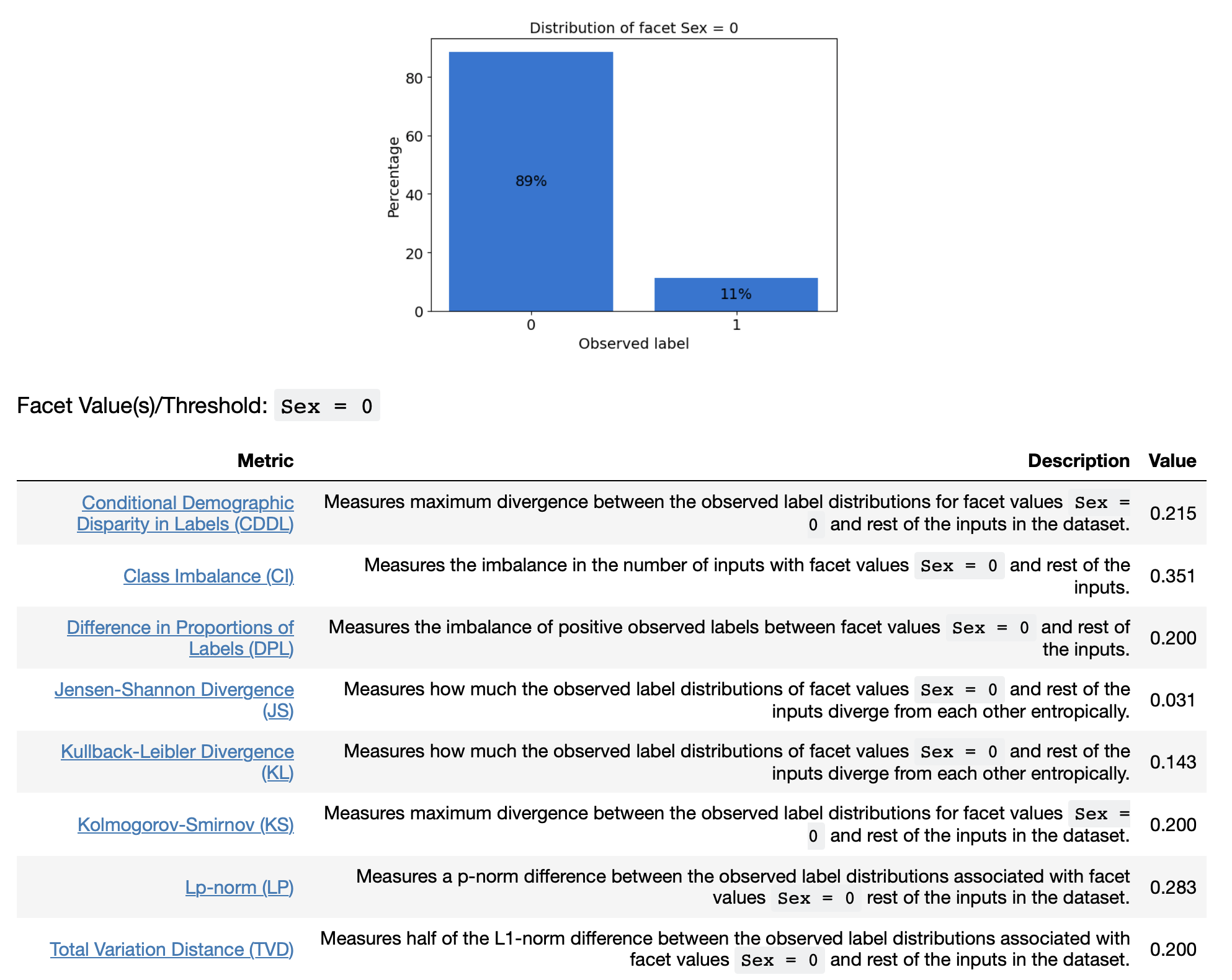
To see if there is bias towards either males or females, a SageMaker Clarify job calculates two kinds of bias metrics for the feature ‘Sex.” The pre-training metrics detect the fairness of training data and post-training metrics detect the fairness of the model predictions. The metrics are viewable inside SageMaker Studio and also as files stored in S3.
Figure 1 is a sampling of the output from the Clarify job. It shows a bar chart showing the distribution of the labels (1 means income greater than $50,000) plus a table with the 9 fairness metrics for females (Sex=0).
There are also Clarify results for the post-training metrics. Figure 2 shows a table listing of the 13 post-training metrics.
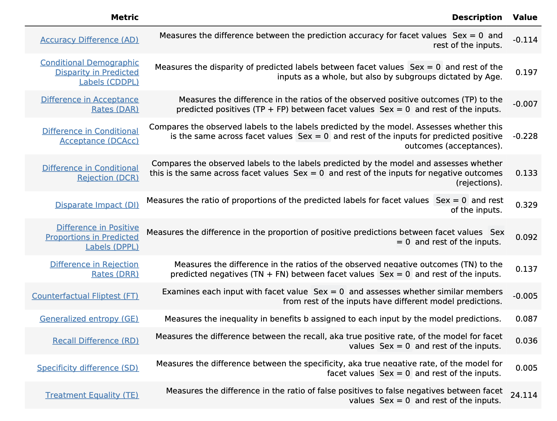
Some skill is needed to interpret the results and decide which metrics are the best fairness indicators for this project. To learn more about each metric, see the article Learn How Amazon SageMaker Clarify Detects Bias and Amazon’s whitepaper about AI Fairness and Explainability.
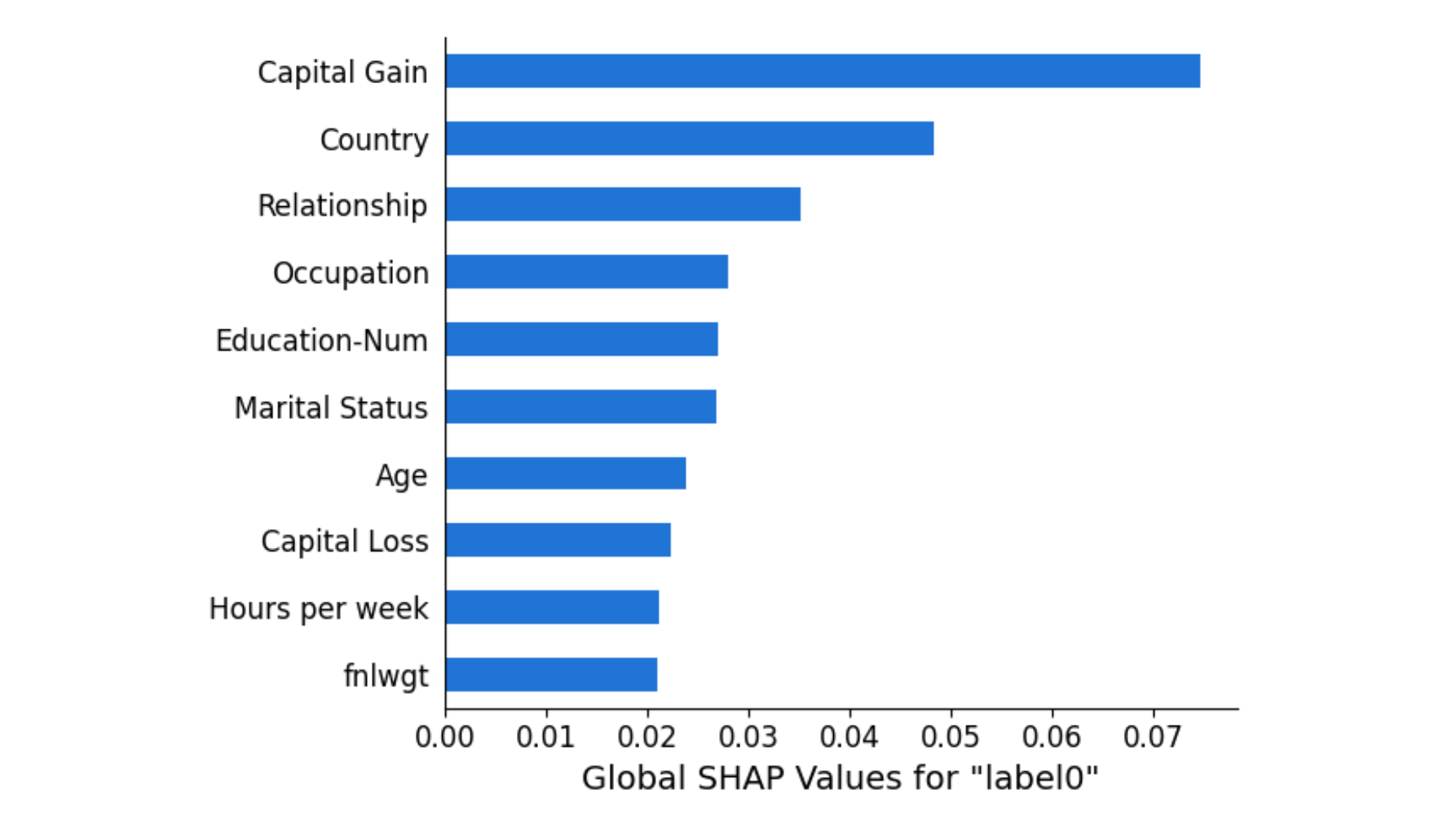
Regarding explainability, the notebook configures a second Clarify job to uncover which features contribute to the model predictions. Just like with the fairness metrics, the results can be viewed in SageMaker Studio or from files stored in S3. The results are given as SHAP values, giving the top 10 features (out of the 14 in the dataset) with the greatest feature attribution. As pictured in Figure 3, “Capital Gain” and “Country” are the top two features that contribute to the model predictions.
EXPLAINABILITY WITH IMAGE DATA
The notebook with image data uses images from the Caltech-256 dataset to show image classification. This notebook ran in approximately 30 minutes on an ‘ml.t3.medium’ instance with the Data Science 3.0 kernel. No code changes required.
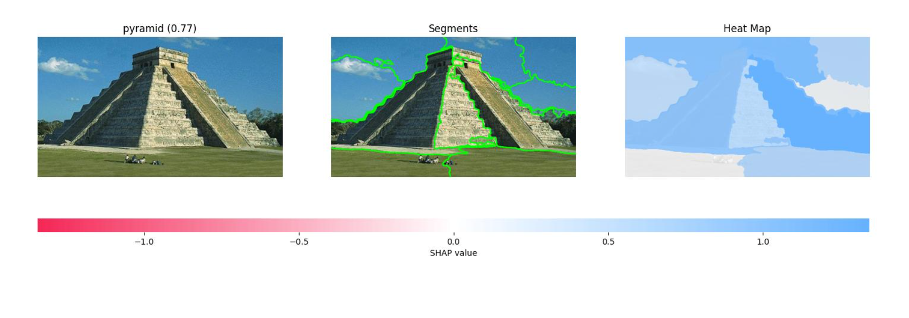
To explain which parts of the image contribute to the classification, the notebook configures and runs a Clarify job and puts the results into S3 as a PDF file. The results show three visuals for each image in the test set. The first shows the original image with the predicted classification. The second shows the image segments that contributed to the classification. The third shows a heatmap of which features increase and decrease the overall confidence score.
Figure 4 shows the results for an image that was classified as a gorilla. The heatmap on the far right has some pink and red areas, which are the segments that decrease the confidence score.
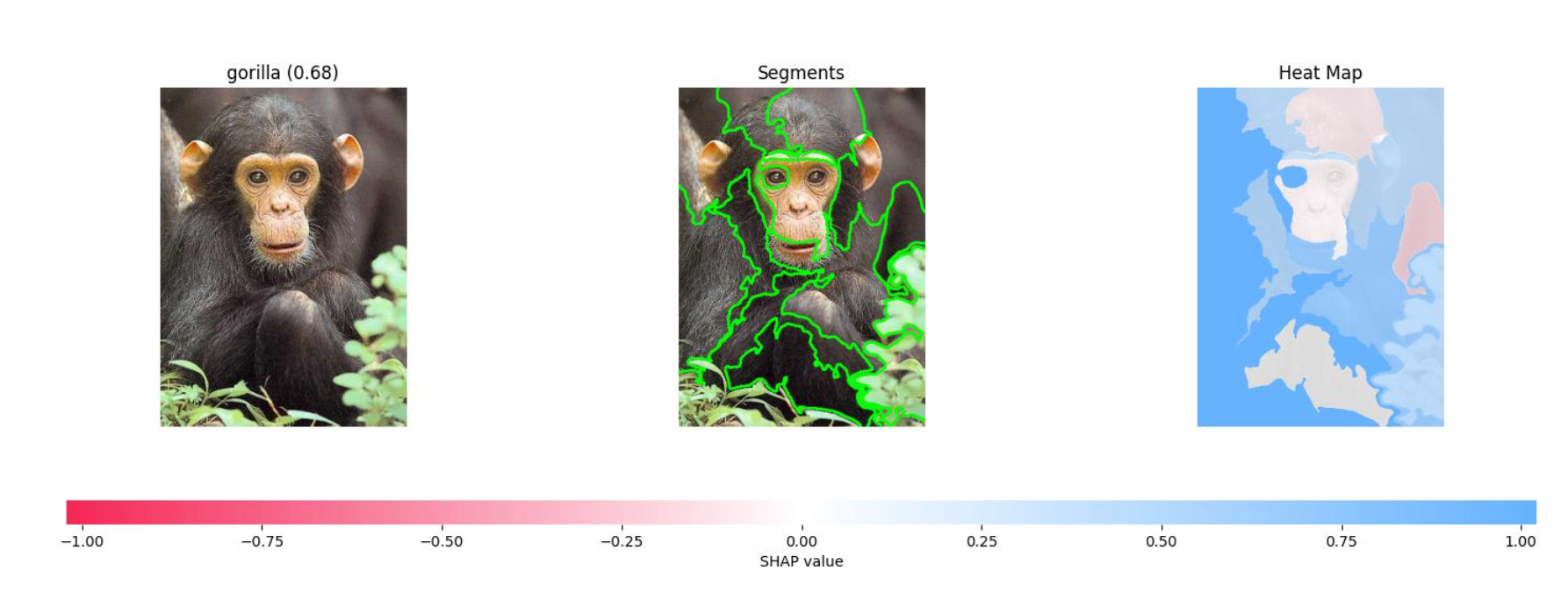
Figure 5 shows the results for an image that was classified as a pyramid. The heatmap on the right has fewer white/pink segments and no red segments.
Some skill is needed to interpret the results. This type of explainability for images helped uncover some computer vision projects gone wrong, like the project that classified animals in snow as wolves and the project that classified images with rulers as skin cancer.
TEXTUAL DATA EXAMPLE
The notebook with textual data uses a collection of women’s clothing reviews to do sentiment analysis. Of the three notebooks, this one needed the most changes to be runnable. An ‘ml.t3.medium’ instance could be used, but the ‘PyTorch 1.10 Python 3.8 CPU Optimized’ kernel was required. The pip installs also needed adjustments. Due to a ResourceLimitExceeded error during training with the suggested instance (‘ml.g4dn.xlarge’), an ‘ml.p3.2xlarge.’ instance was required. These are the installs actually needed:
!pip install "datasets[s3]==1.6.2"
!pip install captum --upgrade --quiet
!pip install --upgrade boto3
The explainability Clarify job uses TextConfig to control the granularity of the explanations (sentence, paragraph, or token). After the Clarify job runs, the results are visualized to understand which parts of the review contributed to the labeling.
Figure 6 shows the results from the sentence configuration. Each sentence is highlighted to show whether it is negative, neutral, or positive.
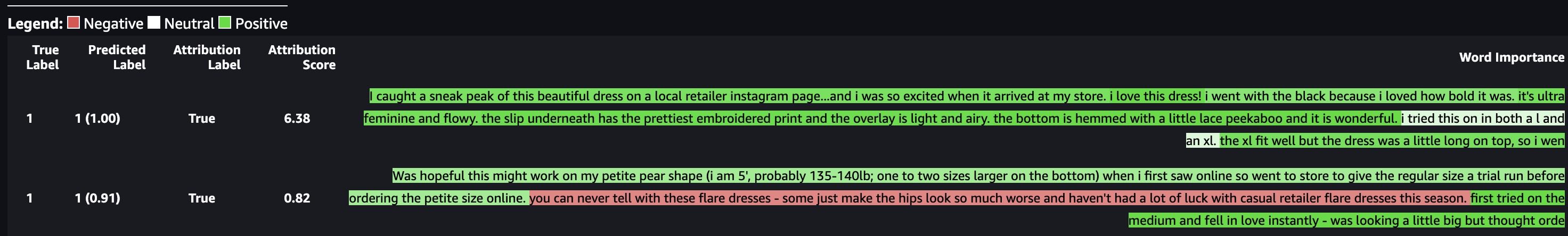
Figure 7 shows the results for the token configuration. Each word is highlighted to show whether it is negative, neutral, or positive.
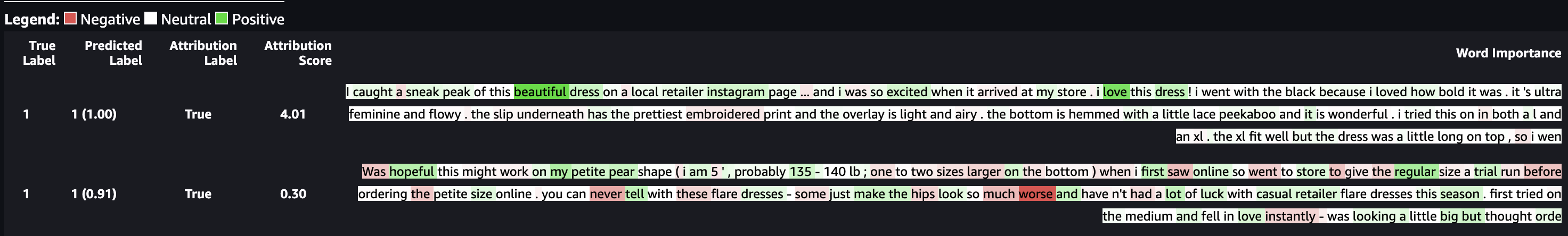
As with the previous results, some skill is required to dissect and understand the explainability report. I am wondering in the second screenshot on line one why “dress” is highlighted in a medium green, indicating that the word is mostly positive. Seeing that makes me wonder if the dataset was skewed to have mostly dress reviews that were positive. Do some negative reviews of dresses need to be included to make the data more balanced?
CONCLUSION
Amazon SageMaker Clarify creates reports that can be used to improve fairness and explainability. AWS provides excellent sample notebooks for getting started with tabular, image, and textual data. Since every analytics project is unique like a snowflake, interpreting the results will likely require the entire data science team to collaborate and to deep dive into AWS guidance on choosing metrics.
I hope this jumpstarts your journey of creating fair and explainable AI.
REFERENCES
An earlier version of this post was published in November 2023.
-
Image by mediamodifier from Pixabay ↩